Partager la publication "How to make complex content more digestible to enlarge your readership?"
Your organisation produces interesting technical publications and content? But too boring for the average reader? Find out how to use social media to reach a bigger audience by making your content more understandable and interesting.
United Nations publishes 500 new titles every year in international law, peacekeeping, human rights, natural resources and other areas. The OECD releases yearly over 250 books in a multitude of complex subjects such as taxing, migration and economics. Too often this valuable content goes unseen by thousands and thousands of potential readers interested in these new findings.
In addition to the “obligatory” press releases, launch events and newsletters, use these three approaches to make sure you no longer miss your potential audience.
Find a viewpoint that speaks
Every book and publication has something interesting in them; you just need to identify it and put it forward in an interesting manner. For example an article OECD Standard Codes for the Official Testing of Agricultural and Forestry Tractors doesn’t sound very tempting to an average reader, but how about a video on Saving farmers’ lives?
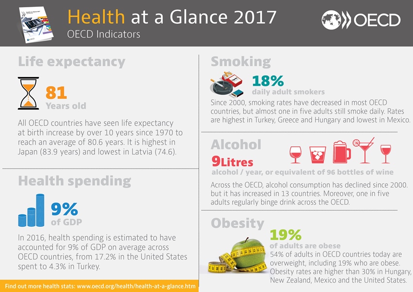
If you don’t have the resources to produce a video, consider summarizing the most pertinent and interesting points in an infographic.
Another possibility is simply to write an article around an interesting question. See for example BEPS: why you’re taxed more than a multinational which gives an easily approachable angle to the highly technical subject of base erosion and profit shifting.
The human touch
People like to read about people. And we all have an interesting story to tell. Put on the scene the people behind your publication: the analyst, the statisticians, and other experts. How do they do their work? How did they work together to produce the publication? What is their work day like? This gives you endless possibilities for articles, interviews, videos, photos, blogs.
(example: photo of an analyst : find free image to use; link to an article?)
Connection to every-day life
All the work done somehow connects to our everyday lives whether it’s finance, economics, agriculture, or corporate taxation. This viewpoint answers the question why should I care. E.g. the video Ending Overfishing shows in a dramatic way how overfishing affects us all, potentially in a drastic way. You can also make statistics more understandable using concrete examples and infographics; see for example the Helpling blog talking about food waste. This type of an example would make the message come through much stronger from an expert report such as the OECD Reference Manual on Strategic waste prevention.
And why not include this approach into the publication itself? Many publications contain case studies in easily understandable context. Going even further, the OECD publication Income Inequality sacrifices a whole chapter to the question How does income inequality affect our lives.
Looking at your technical content from a different, more digestable, angle will give your content more readership and helps get the message through e.g. to policy makers. An interesting combination of all of the three methods above is the OECD Insights blog. It contains articles on interesting subjects, often related to our everyday lives, and written by OECD experts.
[CFPJmasterclass]
Cet article a été rédigé par Petrus Kaartinen dans le cadre du module 3 de la formation certifiante « Community Manager ». Il s’intègre dans la série [CFPJmasterclass].
Partagez cet article et suivez Petrus sur Twitter !


Laisser un commentaire